This sketch was my idea for the opening of an animated music video for the obscure Christian band Daniel Amos, who I have really gotten interested into lately. I'm not a big fan of Christian music, but I was introduced to the group through Terry Scott Taylor, the talented songwriter who did the quirky score for some of Doug TenNapel's projects, like The Neverhood games and Nickelodeon's Catscratch. And honestly, this is a really good group, Christian or not, so I recommend listening to them and anything else Terry's done, solo or with Daniel Amos/The Swirling Eddies and Lost Dogs, before judging them. As to the image in question, this was an idea I had for the song off what is considered their greatest album, 1987's Darn Floor-Big Bite, "Earth Household". It's a very beautiful song, heavy on atmosphere and a haunting ambience, and one of my personal favorites from the album. So I was trying to think of how this could be put into music video form, since the song (and the album in general) is about the incomprehensibility and mystery of God and the unknown, and I wanted images that not only fit the theme, but the music as well. If you want to get an idea as to the kind of atmosphere I'm looking for here, listen to the song while looking at this image above:
I can picture that hazy, foggy, barely-visible forest appearing as the music starts up and Terry (pictured in silhouette) walking up out of the mist, strumming the guitar chords and then stopping to play a while, before silhouettes of Tim Chandler (the bassist) and Ed McTaggart (the drummer) appear from the mist as their parts kick in, and while I don't have a clear idea as to what I plan to do with the video concept yet, I have a good idea for the atmosphere: the foggy, cloudy forest, a dark household, and images in a lit neighborhood or apartment complex at night. Might even throw some rain in there as well.
My brother mentioned that he could totally picture me animating this one.
Both of these were attempts at analyzing head construction. Personally, I've trying to stray away from the "Simpsons-esque" style I've used in the past, since I feel it limits expression and the eyes take up too much room and other things that kinda limit it. I had been trying to figure out other styles with which to draw from, as well as attempting to analyze how my own style could work. Note the bottom image with the realistic head and the cartoon head comparison.
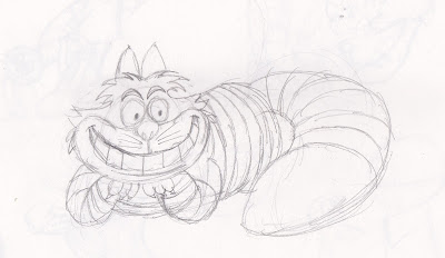
Time for some attempts at sketching Disney characters! Here, I tried my hand at Bambi, a very light, sketchy Cheshire Cat, and the Genie with a little note as to where to put his earring. For the Genie, I used an image from Eric Goldberg's (the guy who animated the Genie) book as reference.
This is sort of a commentary on censorship. If what I heard was correct, older cartoons have had smoking censored out. I know smoking is bad, but come on, sometimes it's part of a character and his trademark to have a cigarette or cigar, and to try to edit it out of cartoons, older or otherwise, because they want to protect kids from it, even if it isn't depicted as being a major part of the character, is proof as to how "politically-correct" this country's gotten, and I hate it. Give Jose Carioca back his cigar, Disney!
We all know the term, but I felt it was fun to depict it literally. Before you get any disturbing, innuendo-based images in your head, she landed on the guy and squashed her. Seriously, it's annoying how people could assume such perverted things in EVERYTHING, even when it's not intentional. But then again, given my love for stuff like Rocko's Modern Life...
This was my first attempt at drawing Brianne Drouhard's Billie The Unicorn, a character that she created for a picture book that I now happily own a copy of, and I used the cover for reference. Check out Brianne's artwork on her blog or DA pages: http://potatofarmgirl.blogspot.com http://potatofarmgirl.deviantart.com
This was a possible character redesign I did for the character of my manga-esque graphic novel concept, Mikako. Yes, I do have an interest in working with the manga style sometimes, but I still want to handle a diverse range of styles while utilizing my own touches to them. If you're unfamiliar with it, take a gander here: http://maniacaldude.deviantart.com/gallery/#/d4869pj
No, this is NOT ripping off "My Life As A Teenage Robot". She's just a cute little girl who happens to be a cyborg.
This was my attempt at rendering Bucky Katt from the comic strip, "Get Fuzzy", into a design reminiscent of Daggett from "The Angry Beavers". Why? Because I can totally imagine Richard Horvitz, the guy who did the voice of Daggett and Invader Zim, doing the voice of this Siamese a-hole.
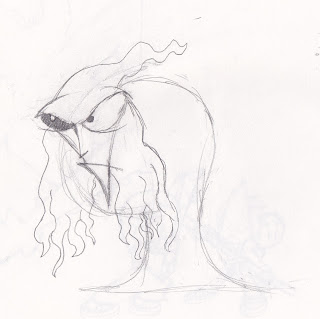
Some kids growing up in the 80s watched an obscure anime film known as "Unico In The Island Of Magic," based around the title character created by my personal favorite manga artist, Osamu Tezuka. I managed to watch both of the Unico movies, since they're found on Youtube. This was my re-imagining of the movie's villain, Lord Kuruku, with some Doug TenNapel inspired elements thrown in to make him even weirder than he already was. Earthworm Jim's head kinda influenced this Kuruku's head, and I drew from Klogg, the villain of The Neverhood, for one of his eyes. Yeah, I know, I'm absolutely insane, but hey, I like to toy around with odd ideas.
This was a monster I came up with for a project in Storyboarding, about a monster failing to scare a little girl in her sleep. And before you ask, YES, this was heavily inspired by Maurice Sendak's Where The Wild Things Are. Can I help it? The designs for the creatures are so memorable and iconic that I wanted to use it somehow, but at the same time, I didn't want it to seem like a total copy, so I exaggerated some of the body structure and made him more cartoonish.
And here are a few more extra doodles:
And... that's pretty much it for now. Until next time, see ya!


No comments:
Post a Comment